From the top...
In this tutorial, we'll build a simple website together, incorporating a single, scrolling page with various layout elements, visual effects and one interactive element. We'll build our website starting from the top and working our way down as we add more and more content.
To begin with we want our website to make an immediate impact, and there's no better way to grab your viewer's attention than with a big, bold header image. To achieve this, we'll use the <header> tag, and inside add an <img>. For now, any image will suffice, though something eye-catching and high-resolution would be ideal.
Code
<header>
    <img src="img/htbaw_banner.jpg" alt="Example banner image">
    <h1>A demo website</h1>
</header>
header {
    position: relative;
}

img {
    max-width: 100%;
    min-width: 100%;
}

h1 {
    background-color: #000;
    color: crimson;
    font-weight: normal;
    padding: .5rem;
    margin: 0;
}

header > h1 {
    position: absolute;
    bottom: 40%;
    left: 30%;
}
Preview

Adding our first content section
Next, let's add to our website an initial section of content. To do this, we'll define an empty "section" element inside the "main" element:
<main>
    <section>
        <h1>"Let the good times begin"</h1>
    </section>
</main>
Now we need some actual content with which to populate our newly created section. For now, we can copy/paste some arbitrary text to serve as a placeholder—just a few sentences should be fine here. You can of course replace this text later, but for the time being let's add the following paragraph:
<p>To the disinterested trickle of tourists, commuters and vagrants, whom I presently stride amongst, a little shop window sign bellows the banality: "let the good times begin". I have always been suspicious of advertisers, with their winking suggestions and vague, empty promises. The adjoining building is marked with an equally inscrutable insignia, an ashen scrawl of years-old graffiti reading "CLEMPS", or is it "CHEMPS"? A nickname, perhaps, or maybe an initialism for something or other? The "C" and its indeterminate neighbour could perhaps denote Central London, but then—the thought is drowned out by the shrill, staccato beep of a pedestrian crossing. I've grown accustomed to being yanked cruelly from such reveries by so-called "circumstance": whose beautifully simple etymology I enact idiomatically, inexplicably, rather than crossing the road. It's been months since I've felt alive.</p>
Next, let's complement our text with some more visually engaging content. We'll add a basic two-column layout, an image and some more stylised text, to create something that looks like this:
To begin with, let's define a CSS class for elements that require a columnar layout. This will be helpful as we'll want to reuse this type of layout later on:
.columns {
    display: flex;
    flex-direction: column;
    gap: 2rem;
}

.columns > * {
    flex: 1;
}

@media (min-width: 992px) {
    .columns {
        flex-direction: row;
    }
}
Now we can go ahead and add the HTML. We create a div element that uses our new "columns" class, and inside this class we create two child div elements, which represent the two columns that we want. In the first column, we add another placeholder image (a recent photo you've taken, for example, or a royalty-free image found online). In the second column, we add a subheading using the h2 element, and another paragraph of arbitrary text. Of course, nothing is ever truly arbitrary, and the choices that we make reveal things about ourselves that are sometimes obvious only in retrospect.
Lastly, we add a div using the class "diagonal-text", so that we can style the text in this section accordingly.
<div class="columns">
<div>
<img src="img/htbaw_image_1.jpg" alt="">
</div>
<div>
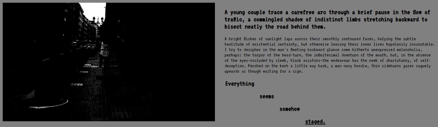
<h2>A young couple trace a carefree arc through a brief pause in the flow of traffic, a commingled shadow of indistinct limbs stretching backward to bisect neatly the road behind them.</h2>
<p>A bright flicker of sunlight laps across their smoothly contoured faces, belying the subtle beatitude of existential certainty, but otherwise leaving their inner lives hopelessly inscrutable. I try to decipher in the man's fleeting backward glance some hitherto unexpressed melancholia, perhaps: the torpor of the head-turn, the infinitesimal downturn of the mouth, but, in the absence of the eyes—occluded by sleek, black aviators—the endeavour has the reek of charlatanry, of self-deception. Perched on the kerb a little way back, a man navy hoodie, thin sideburns gazes vaguely upwards as though waiting for a sign.</p>
<div class="diagonal-text">Everything seems somehow <u>staged.</u></div>
</div>
</div>
Although we added the diagonal text as a simple div element, it will be much easier to achieve the desired diagonal layout by first re-rendering the text in a table. To do this, we can use the following Javascript function:
function renderDiagonalText() {
    [...document.getElementsByClassName("diagonal-text")].forEach(el => {
        const table = document.createElement("table");
        const words = el.innerHTML.split(" ");
        table.className = "diagonal-text";

        words.forEach((word, idx) => {
            const row = document.createElement("tr");
            for (let i = 0; i < words.length; i++) {
                const cell = document.createElement("td");
                cell.innerHTML = i === idx ? word : "";
                row.appendChild(cell);
            }
            table.appendChild(row);
        });

        el.after(table);
        el.remove();
    });
}
The job of this function is simply to look for any elements that we've tagged with our "diagonal-text" class, grab all of the text within each of them, then split it up into individual words and replace the original element with a table in which each consecutive word occupies the next cell across and down (i.e. diagonally adjacent).
At this point, to keep things organised, we also write a main "init" function, to be called when our webpage is first loaded, like so:
function init() {
    renderDiagonalText();
}
At the moment, all this function does is call the renderDiagonalText function, but we can add more to it as we add further Javascript functionality in subsequent steps. To trigger this function, we need to set the onload attribute of the "body" element of our HTML to "init();"
With our diagonal text re-rendered in table form, we can finish off the diagonal layout by setting the following CSS:
.diagonal-text {
    visibility: hidden;
}

table.diagonal-text {
    visibility: visible;
    font-size: 1.5rem;
    font-weight: bold;
}

.diagonal-text > tr:first-child > td {
    padding: 0 .5rem .5rem .5rem;
}

.diagonal-text > tr:first-child > td:first-child {
    padding: 0 .5rem .5rem 0;
}

.diagonal-text > tr:not(:first-child) > td {
    padding: .5rem;
}
Adding our second content section
For the second section, we add some more text and another image, and reuse the columnar layout style that we defined in the previous section. This time, instead of placing an image inside one of our columns, we include only text, adding an image outside of the "columns" div, so that it will span the width of the entire section. For this section, it's best to choose a short, wide image, like the abstract landscape in the example below. Again, any text content will suffice: just add about four paragraphs worth to achieve the desired layout.
Code
<section>
<h1>The bright blob of an afterimage</h1>
<div class="columns">
<div>
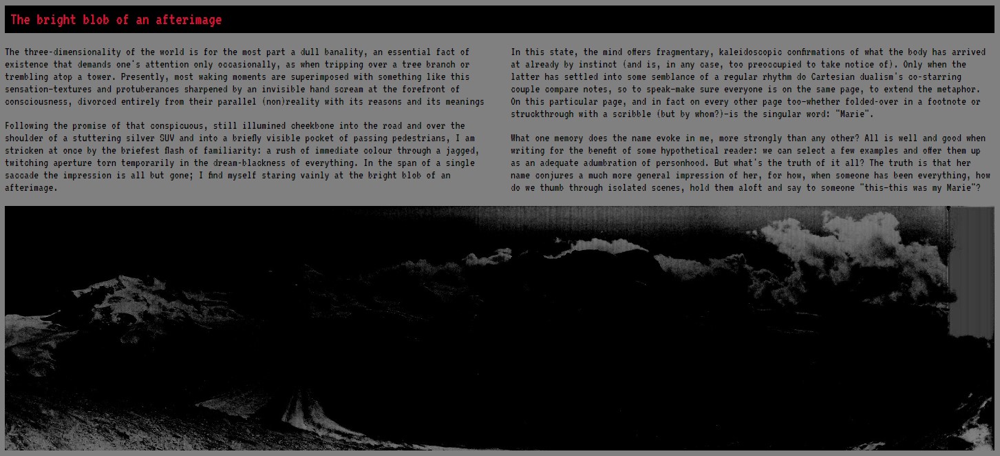
<p>The three-dimensionality of the world is for the most part a dull banality, an essential fact of existence that demands one's attention only occasionally, as when tripping over a tree branch or trembling atop a tower [...]</p>
<p>Following the promise of that conspicuous, still illumined cheekbone into the road and over the shoulder of a stuttering silver SUV and into a briefly visible pocket of passing pedestrians, I am stricken at once by the briefest flash of familiarity: a rush of immediate colour through a jagged, twitching aperture torn temporarily in the dream-blackness of everything [...]</p>
</div>
<div>
<p>In this state, the mind offers fragmentary, kaleidoscopic confirmations of what the body has arrived at already by instinct (and is, in any case, too preoccupied to take notice of) [...]</p>
<p>What one memory does the name evoke in me, more strongly than any other? [..].</p>
</div>
</div>
<img src="img/htbaw_image_2.jpg" alt="">
</section>
Preview
Adding a third section
For our third section, let's add we'll use a three-column layout, with a circular image in the middle column. We'll add some rotated text too, which will follow the edge of the image, like so:
First, let's define the section and "columns" div, as we've done previously:
<section>
<h1>Recollections</h1>
<div class="columns">
<div>
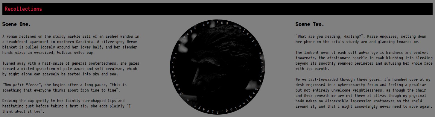
<p>A woman reclines on the sturdy marble sill of an arched window in a beachfront apartment in northern Sardinia [...]</p>
</div>
<div> class="flex-center">
<div> class="img-wrapper flex-center">
<img src="img/htbaw_image_3.jpg" class="rounded">
</div>
<div> class="circular-text">Always a beginning, always an end, always another beginning.</div>
</div>
<div>
<p>"What are you reading, darling?", Marie enquires, setting down her phone on the sofa's sturdy arm and glancing towards me [...]</p>
</div>
</div>
</section>
In the left and right columns, we add some "arbitrary" text in our paragraph elements, while the middle column contains a div, used to container image and circular text. The text is not arbitrary, of course. We say it, but it's not. From a young age the circle has always made me think of life, death, rebirth... The whole fucking thing coming back around ad infinitum, the snake eating itself... So forth and so on.
For layout purposes we add a few CSS classes here, too. "flex-center" is a general purpose class for keeping things nicely centered within their container elements, while "img-wrapper" is a helper class to control the size and positioning of our image.
.flex-center-column {
    display: flex;
    align-items: center;
    justify-content: center;
    flex-direction: column;
}

.img-wrapper {
    position: relative;
    height: 100%;
    width: 100%;
    display: contents;
}

.img-wrapper > img {
    height: 100%;
    min-width: unset;
    max-width: unset;
    max-height: unset;
    object-fit: cover;
    position: absolute;
    top: 0;
    padding: 1rem;
    box-sizing: border-box;
}
Meanwhile, the "rounded" class simply rounds off the edges of our image to make it circular, while the "circular-text" class is responsible for rotating the text to match the image.
img.rounded {
    border-radius: 50%;
    max-height: 80%;
    min-width: 80%;
}

.circular-text {
    position: relative;
    display: flex;
    align-items: flex-start;
    justify-content: center;
    visibility: hidden;
    color: #808080;
}

.circular-text > span {
    position: absolute;
    min-width: 0.5rem;
    text-align: center;
    padding: 1rem;
    margin: 0;
    visibility: visible;
    transform-origin: bottom center;
    box-sizing: border-box;
}
Unfortunately, as with the "diagonal-text" class that we used earlier, the raw CSS above for the "circular-text" class is not sufficient by itself to achieve the effect that we want, so we'll need to write some more Javascript to get the job done. The following function will re-render the content of the "circular-text" as a series of child "span" elements, rotating each one so as to exactly follow the rounded outline of our image.
function linspace(start, stop, num) {
    const step = (stop - start) / num;
    return Array.from({length: num}, (_, i) => start + step * i);
}

function renderCircularText() {
    [...document.getElementsByClassName("circular-text")].forEach(el => {
        const img = el.previousElementSibling;
        const radius = Math.ceil(img.offsetWidth / 2);
        const angles = linspace(-180, 180, el.textContent.length);
        el.style.height = `${img.offsetHeight}px`;

        [...el.textContent].forEach(letter => {
            const span = document.createElement("span");
            span.innerText = letter;
            el.appendChild(span);
        });

        [...el.children].forEach((span, idx) => {
            span.style.height = `${radius}px`;
            span.style.transform = `rotate(${angles[idx]}deg)`;
        });
    });
}
Don't forget, we also need to update the init function that we defined earlier, to add call to our new function. The updated init function should be as follows:
function init() {
    renderDiagonalText();
    renderCircularText();
}
Lately, I've been thinking more and more about the passage of time. Yesterday I caught a glance of a film of which I'm fond, and wondered: by the time I watch that film next, how much will have changed? I unfurl a great length of rope and drop one end deep into an abyss, in hopes of some future self taking up the slack and maintaining the pleasant pretense of continuity between present and past.
Building an interactive section
For this section, let's leverage the power of Javascript to create an interactive experience for the reader: a section with a flickering "static" effect, readable only in small portions at a time, as they're illuminated according to the position of the user's cursor. It's a nice effect, but one has to ask—what do we want to achieve by forcing the reader to interact with the site in such a way?
The HTML for this section is pretty straightforward, being almost identical to some of our earlier sections, save for an additional div elements with a specific CSS class, which we'll use to create the static effect.
<section>
    <div class="static-wrapper">
        <h1>The lies we tell</h1>
        <p>At a rainbow's end folk mythology makes, to the curious child, the impossible promise of a pot of gold. With time, of course, we come to learn that the rainbow never had an end [...]</p>
        <p>Could it really have been her? <i>Here</i>, of all places? But how—no, there isn't time for idle speculation [...]</p>
    </div>
</section>
For the "static-wrapper" CSS class, we need to specify the following:
.static-wrapper {
    position: relative;
    color: #fff;
    box-sizing: border-box;
}

.static-wrapper::before {
    content: "";
    position: absolute;
    left: 0;
    top: 0;
    width: 100%;
    height: 100%;
    background-image: url("../img/htbaw_demo_static.gif");
    opacity: .15;
    z-index: -1;
}

.static-wrapper::after {
    content: "";
    position: absolute;
    left: 0;
    top: 0;
    width: 100%;
    height: 100%;
    background: radial-gradient(circle var(--static-dia) at var(--static-xpos) var(--static-ypos), transparent, rgba(0, 0, 0, 0.95) 10%);
    transition: background .1s linear;
}

.static-wrapper p {
    padding-left: 1rem;
    padding-right: 1rem;
}

.static-wrapper p:last-child {
    padding-bottom: 1rem;
}
The above CSS will create the flickering static background effect that we want for this section, but the interactive hover-over effect (to illuminate our text) is easier to achieve via Javascript. This can be done relatively straightforwardly, as follows:
function initStaticMouseoverEffect() {
    [...document.getElementsByClassName("static-wrapper")].forEach(el => {
        let rect = el.getBoundingClientRect();
        document.documentElement.style.setProperty("--static-dia", `${Math.round(rect.height * 4)}px`);

        el.onmousemove = (ev) => {
            rect = el.getBoundingClientRect();
            const xpos = +Math.round((ev.clientX - rect.x) / rect.width * 100);
            const ypos = +Math.round((ev.clientY - rect.y) / rect.height * 100);

            document.documentElement.style.setProperty("--static-xpos", `${xpos}%`);
            document.documentElement.style.setProperty("--static-ypos", `${ypos}%`);
            document.documentElement.style.setProperty("--static-dia", `${Math.round(rect.height * 4)}px`);
        };
    });
}
Adding some animated content
In this section, we reuse the columnar layout one more time, this time incorporating an animated GIF image with large overlaid text, as shown below:
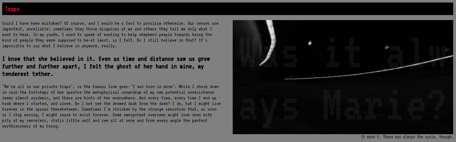
The HTML is very similar to our previous sections, except this time we'll use a figure element for our image, so that we can easily add a small but very specific caption.
<figure&rt;
    <div class="flex-center"&rt;
        <image src="img/htbaw_image_4.gif"&rt;</image&rt;
        <div class="img-overlay" id="overlay-text-1">Was it always Marie?</div&rt;
    </div&rt;
    <figcaption&rt;It wasn't. There was always the cycle, though.</figcaption&rt;
</figure&rt;
Our img-overlay class contains the following CSS:
.img-overlay {
    position: absolute;
    height: 100%;
    width: 100%;
    color: #808080;
    font-size: 12rem;
    word-break: break-all;
    text-align: justify;
    opacity: .1;
    user-select: none;
    padding: 1rem;
    box-sizing: border-box;
}
This will create large, semi-transparent, overlaid text. The problem is that we ideally want the font size to be as big as possible, but it's impossible to know ahead of time the size of the image as rendered on the user's screen. Once again, this is where Javascript comes in...
function fixTextOverflow(elem) {
    // First, reset any previous modification made to the font size
    elem.style.removeProperty("font-size");

    const divHeight = elem.getBoundingClientRect().height;
    let scrollHeight = elem.scrollHeight;
    let fontSize = parseFloat(window.getComputedStyle(elem).fontSize);

    // Shrink font size if text has overflow
    if (scrollHeight > divHeight) {
        for (let i = 0; scrollHeight > Math.ceil(divHeight); i++) {
            fontSize--;
            elem.style.fontSize = `${fontSize}px`;
            scrollHeight = elem.scrollHeight;
      }
    }
}
Building our final section
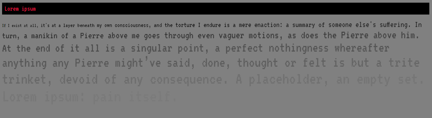
To finish, we'll build a simple section consisting of a paragraph of etxt that gradually gets larger in size and becomes more transparent as it goes on. To begin with, we create a div element with the class "increasing-size-text", and fill it with some placeholder text, for example: "If I exist at all, it's at a layer beneath my own consciousness, and the torture I endure is a mere enaction: a summary of someone else's suffering".
To achieve our desired effect, we'll use a method similar to what we did for the diagonal text in our very first section: using Javascript to first restructure our one element into multiple different elements, for greater flexibility when styling. For this reason, we need to add the following CSS:
.increasing-size-text {
    visibility: hidden;
}

.increasing-size-text > p {
    visibility: visible;
}
To finish, we require one last Javascript function, which will divide our paragraph up into different elements for each consecutive word, and apply font size and opacity styling to each individually in order to generate our desired effect:
function renderIncreasingSizeText(increment = .5) {
    [...document.getElementsByClassName("increasing-size-text")].forEach(el => {
        const words = el.innerHTML.split(" ");
        const para = document.createElement("p");
        const opacities = linspace(1, .025, words.length);
        let fontSize = parseFloat(window.getComputedStyle(el).fontSize);

        words.forEach((word, idx) => {
            const span = document.createElement("span");
            span.innerHTML = word + " ";
            span.style.fontSize = `${fontSize}px`;
            span.style.opacity = opacities[idx];
            para.appendChild(span);
            fontSize += increment;
        });

        el.after(para);
        el.remove();
    });
}